Features - Section Designer
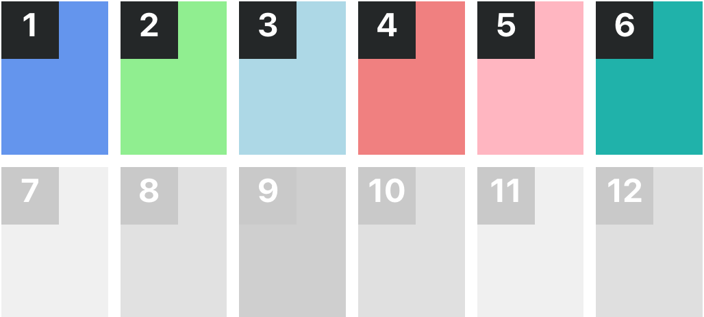
Templates Columns
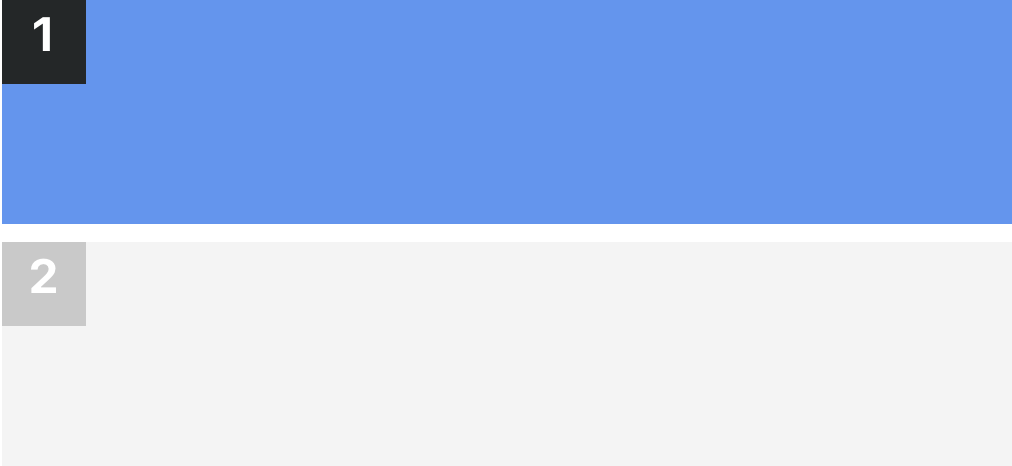
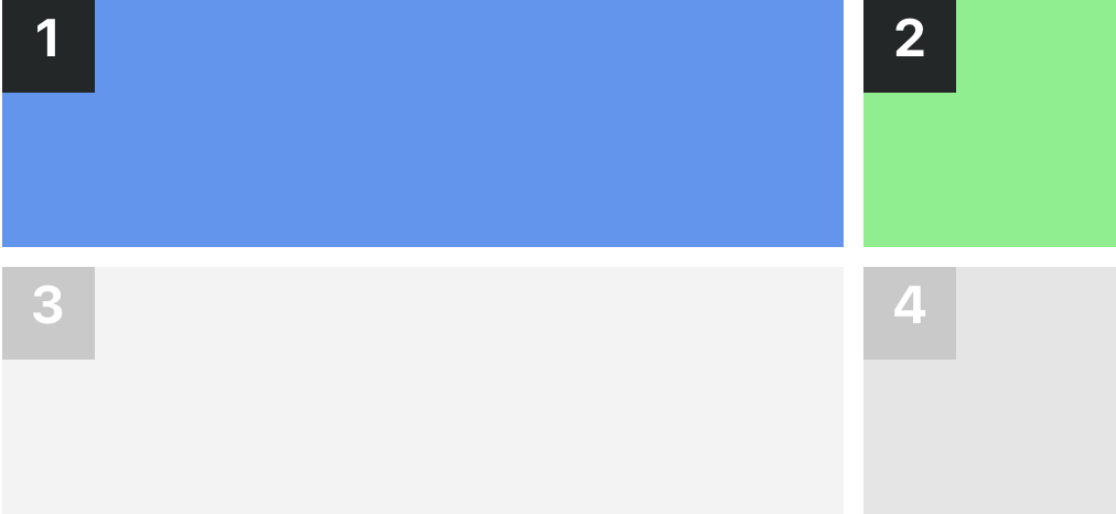
100
This is a single column layout where content occupies the entire width of the section.
Classes:
sc-lt-grid sc-tp-100
Custom tag:
<inner-section template="100"></inner-section>
Key for theme.json:
"col_100";
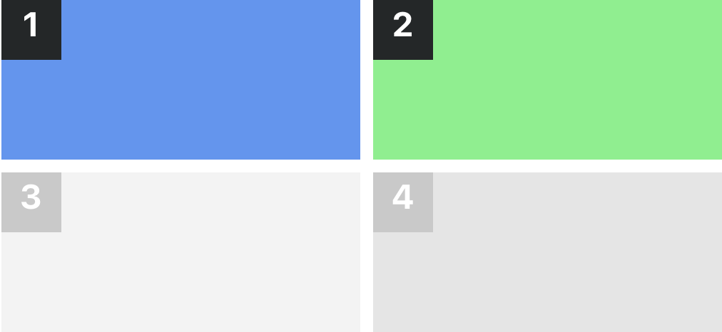
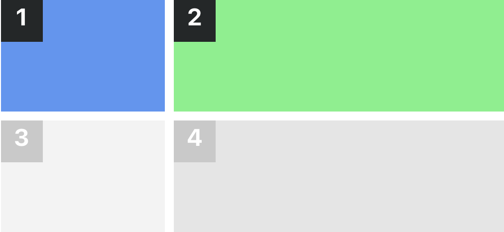
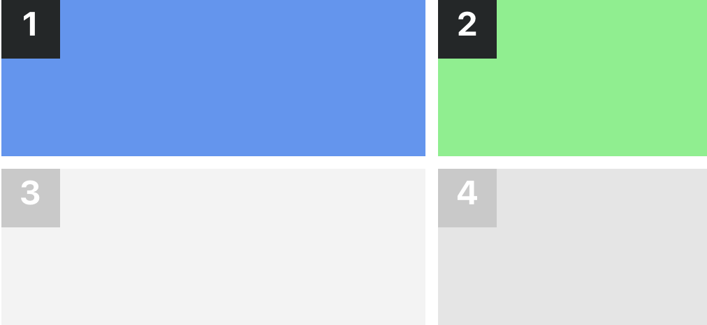
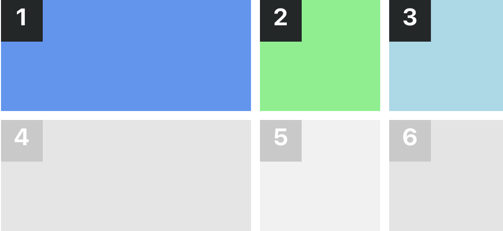
50:50
This is a two-column layout where content is divided equally between two columns.
Classes:
sc-lt-grid sc-tp-50-50
Custom tag:
<inner-section template="50:50"></inner-section>
Key for theme.json:
"col_50_50";
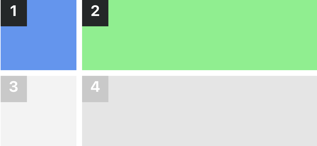
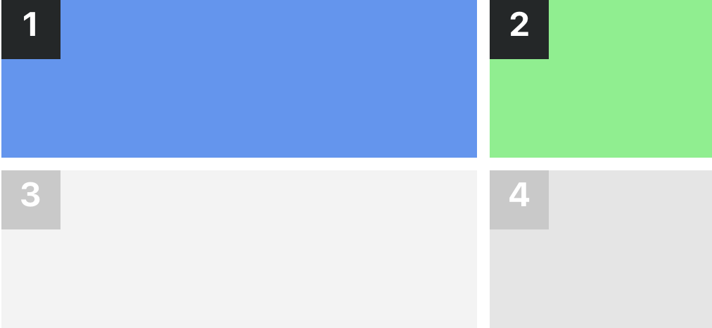
25:75
This is a two-column layout where the first column occupies 25% of the width and the second column occupies 75%.
Classes:
sc-lt-grid sc-tp-25-75
Custom tag:
<inner-section template="25:75"></inner-section>
Key for theme.json:
"col_25_75";
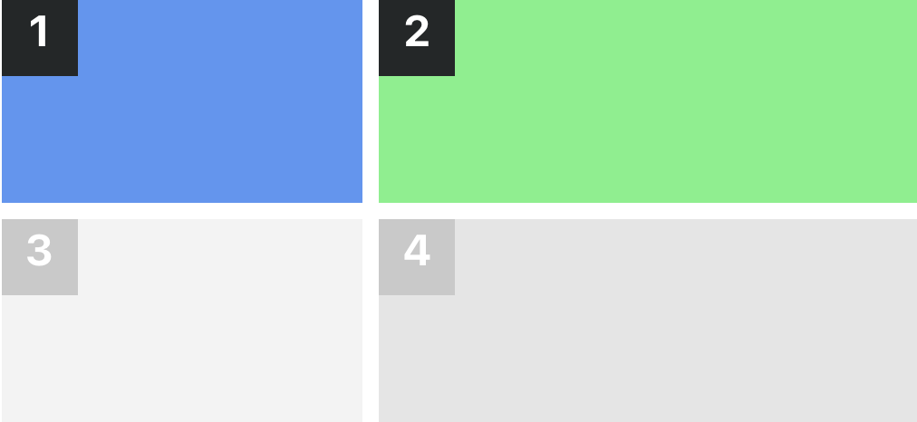
75:25
This is a two-column layout where the first column occupies 75% of the width and the second column occupies 25%.
Classes:
sc-lt-grid sc-tp-75-25
Custom tag:
<inner-section template="75:25"></inner-section>
Key for theme.json:
"col_75_25";
33:66
This is a two-column layout where the first column occupies 33% of the width and the second column occupies 66%.
Classes:
sc-lt-grid sc-tp-33-66
Custom tag:
<inner-section template="33:66"></inner-section>
Key for theme.json:
"col_33_66";
66:33
This is a two-column layout where the first column occupies 66% of the width and the second column occupies 33%.
Classes:
sc-lt-grid sc-tp-66-33
Custom tag:
<inner-section template="66:33"></inner-section>
Key for theme.json:
"col_66_33";
40:60
This is a two-column layout where the first column occupies 40% of the width and the second column occupies 60%.
Classes:
sc-lt-grid sc-tp-40-60
Custom tag:
<inner-section template="40:60"></inner-section>
Key for theme.json:
"col_40_60";
60:40
This is a two-column layout where the first column occupies 60% of the width and the second column occupies 40%.
Classes:
sc-lt-grid sc-tp-60-40
Custom tag:
<inner-section template="60:40"></inner-section>
Key for theme.json:
"col_60_40";
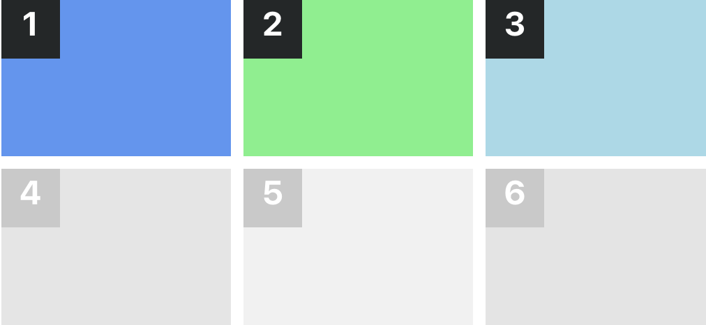
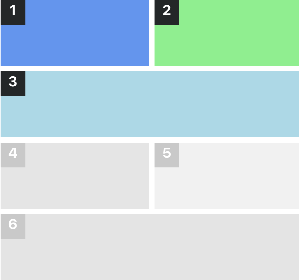
33:33:33
This is a three-column layout where the content is divided equally between three columns.
Classes:
sc-lt-grid sc-tp-33-33-33
Custom tag:
<inner-section template="33:33:33"></inner-section>
Key for theme.json:
"col_33_33_33";
25:25:50
This is a three-column layout where the first two columns occupy 25% each and the third column occupies 50%.
Classes:
sc-lt-grid sc-tp-25-25-50
Custom tag:
<inner-section template="25:25:50"></inner-section>
Key for theme.json:
"col_25_25_50";
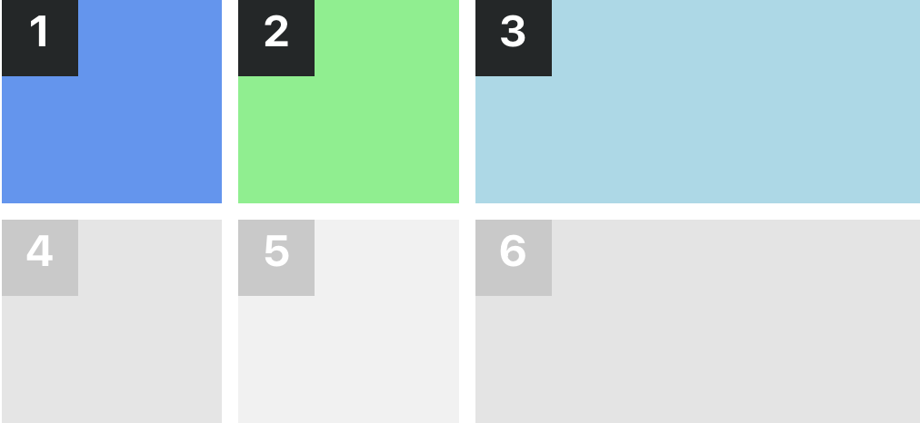
25:50:25
This is a three-column layout where the first and third columns occupy 25% each and the second column occupies 50%.
Classes:
sc-lt-grid sc-tp-25-50-25
Custom tag:
<inner-section template="25:50:25"></inner-section>
Key for theme.json:
"col_25_50_25";
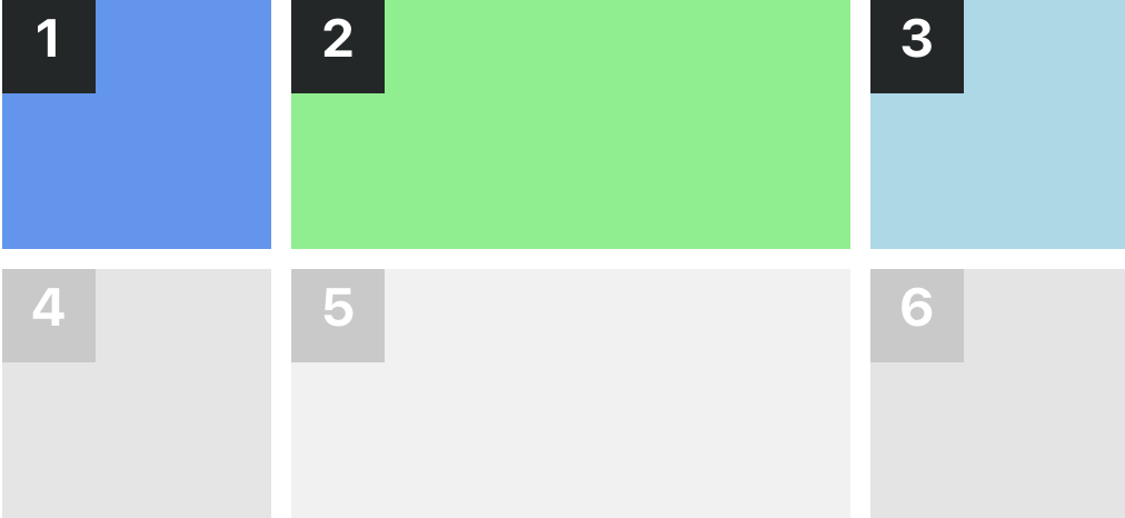
50:25:25
This is a three-column layout where the first column occupies 50% and the second and third columns occupy 25% each.
Classes:
sc-lt-grid sc-tp-50-25-25
Custom tag:
<inner-section template="50:25:25"></inner-section>
Key for theme.json:
"col_50_25_25";
50:50:100
This is a three-column layout where the first two columns occupy 50% and the third column occupies 100%.
Classes:
sc-lt-grid sc-tp-50-50-100
Custom tag:
<inner-section template="50:50:100"></inner-section>
Key for theme.json:
"col_50_50_100";
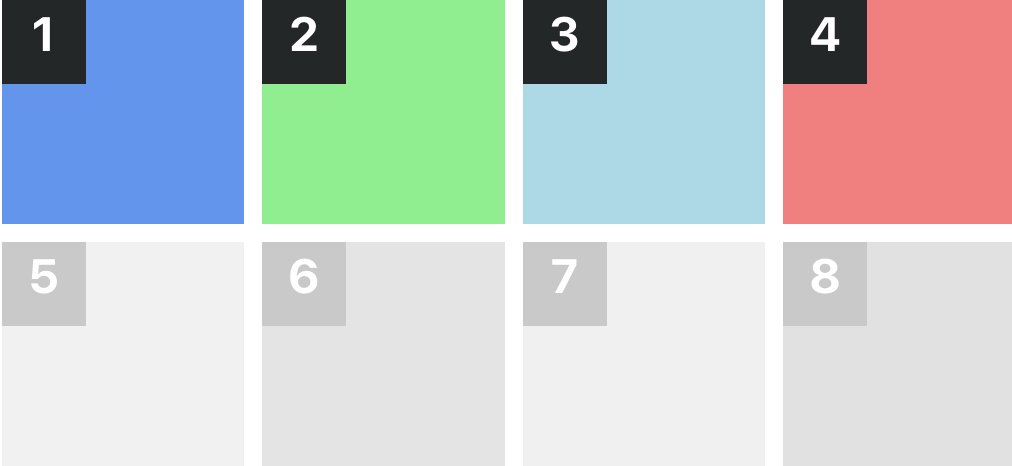
25:25:25:25
This is a four-column layout where each column occupies 25% of the width.
Classes:
sc-lt-grid sc-tp-25-25-25-25
Custom tag:
<inner-section template="25:25:25:25"></inner-section>
Key for theme.json:
"col_25_25_25_25";
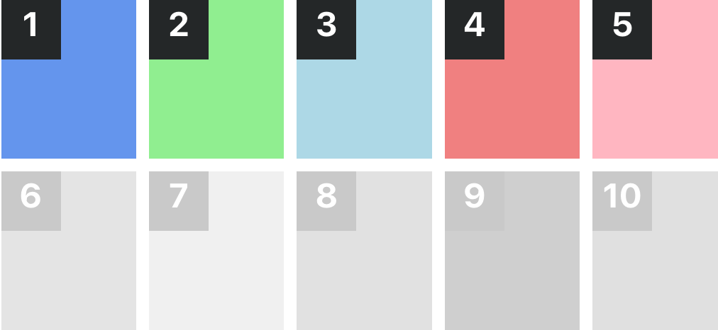
20:20:20:20:20
This is a five-column layout where each column occupies 20% of the width.
Classes:
sc-lt-grid sc-tp-20-20-20-20-20
Custom tag:
<inner-section template="20:20:20:20:20"></inner-section>
Key for theme.json:
"col_col_20_20_20_20_20";
16:16:16:16:16:16
This is a six-column layout where each column occupies 16.67% of the width.
Classes:
sc-lt-grid sc-tp-16-16-16-16-16-16
Custom tag:
<inner-section template="16:16:16:16:16:16"></inner-section>
Key for theme.json:
"col_16_16_16_16_16_16";